Saturday, December 31, 2011

Learning Log: Assignment 4: Textile Structures

Interlude: Analysing Colour, Texture and Proportion.


I found this exercise harder to get to grips with than I had expected.
It took a while to find an image I was happy with that had both a range of colours and texture: a lot of my material had great colour but little texture or vice versa. But when I found a suitable image things got moving.


I used my gouache colours as I find these easier to blend than watercolours.

The broken colours were hardest to match – here I tried to match the predominant colour and then overlay it  - eg mustard overlain with white for the rush seat.

I’m not sure how well I did with the proportions : I started with estimates of the bigger blocks of colour and then worked into the detail of the smaller blocks. 

It was sometimes hard to get an exact match in the yarns so I got as close as possible. This threw up some surprises – a dark green yarn was a better match for the cats fur than a black yarn.

I also chose textured yarns to mimic texture in the image eg for some of the cat’s fur and for the broken colour in the background wall.


Project 8

Stage 1 : Collecting Yarn  and Exploring its Qualities

I’ve set up a small yarn booklet based on the yarns I’ve collected split into two sections – natural ( total or predominantly) and synthetic. I expect to add to this as I go along.

 I haven’t included recycled yarns I use in projects eg strips of paper, bubblewrap, torn voile curtain ( a la my cat spots a bluebottle), scrap silk , old socks etc. I might set these up in a second booklet.

It’s interesting to touch and compare how the yarns look and feel but I really learn most when I actually use them for something specific eg thicker strong yarns made more dramatic ropes than wispy ones – where the structure just got lost, while in weaving, brown paper and voile buckled the piece while masses of textured yarns were too distracting for the mood I was trying to create in my final piece “Solstice”.

Stage 2 : Experimenting with Structures

I enjoyed this stage and in the case of the rope making found it very relaxing.
I was very surprised at the results :

 Paper Weaving
  • Simply weaving two strong colours together was very effective
  • I loved the curvature when using soft tissue woven into harder paper – would be interesting to overprint this with a definite image
  • I also loved the look of the woven drink pouch (silver side)- see above. I was very temped to heat this to see what effect it would have but was afraid I’d poison myself.
  • Using strips of bright colours woven with plain was very pleasing and I loved the effect when there was a space between the strips 


Ropes

Found the feel of the yarns very relaxing but results weren’t so great

  • Loved the results from weaving the cordyline leaves and the plantain – thought these worked best – simple and dramatic. Would like to later try bleaching and  dying some cordaline leaves to see what effect this will have on the results. 

  • Found it easier to see the structure when using thicker / more rigid materials
  • Probably too focused on getting the technique right and not experimental enough
  • Couldn’t really see where I’d use ropes but having done the weaving section now appreciate how they could really add depth to a piece.
Shape and Grid


·       Loved these, though again probably should have pushed the boundaries more. Really liked the idea of looking through ( one of my favourite things) and  shapes within shapes.

·       In the Shape exercise I just wound threads to create the shadow and light and the structure

·       In the Grid  I stretched some mesh across the structure which reminded me of fishing nets…maybe should have made a little fish to put in there….or a bicycle wheel or shopping trolley (more woven structures). I also made a grid within the grid which gave this an extra dimension.

 Project 9 Woven Structures.

 I was dreading this (had previously done a small bit of weaving with a spectacular lack of success) but once I managed to get warped up and going I thoroughly enjoyed the experience.

The first piece was painfully slow….it took days -  but once I got the hang of it things got better and better.
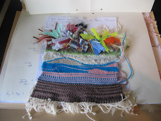

  • Variety of Yarns : I found it difficult to track down weaving yarns – none of the yarn shops in Cork had a selection. So I used the wools that I had bought along with yarns I made myself. I tried a variety of materials : plain, textured ,multicoloured  and metallic wools of varying thicknesses and recycled yarns (strips of silk, paper, bubblewrap, torn voile curtain,  old socks (which had great “give”).  In the first 2 pieces I was keen to experiment and learn,so some things worked wonderfully eg loved curved wefts and the effects from the different yarns especially multicoloureds , silk strips and bubblewrap, while others were less successful – using paper and voile and using knots.

In the final sample I used mainly multicoloured and textured yarns and silk strips. I used some yarns which had metallics threaded through: in the lower section to denote the rich life that is throbbing beneath the surface even when the world seems to be asleep, and in the sky section I used orange and golds to emphasis the sacredness of the solstice.

  • Once I got going I really loved the weaving, both the feel of the yarn and the ping of the warp and how the piece grows before your eyes. I’ve been working with coloured pencils in Start Drawing and learning to stand back to review my work and found this really helpful in the final piece “Solstice”. I didn’t mind that it was a slow process (though it took a lot longer than I had allowed for) and I put on some lovely music and wove away contentedly….I practically purred at times.


  • Final Sample: I’m happy with the overall effect and feel it captures the mood from my story board. This was my first time doing one of these so I’m not sure whether I did it correctly.(note added later..my tutor has suggested using printed text in future) 


    This is in Assessment Submission
  •  I had chosen yarns for the piece but when I wove a small sample to test them I found the blocks of textured yarns distracted from the powerful impact I wanted to achieve so I broke them and mixed them through plain yarns. I’m generally happy with the the colour and texture. I’m not so sure about the proportions : I wanted to have a streaming sky and when I used the yarns I’d picked in the storyboard and sample, they were too insipid and just didn’t work. So I went with more silk yarns and couldn’t figure out how to fade these out without losing impact. I also removed some weaving at the edge and I’m not sure if this is what buckled the piece .  Finally, I’m not sure how to finish and mount the piece – eg do you cut off the warp strings and how do you fix the piece to a mount board as it’s too heavy for the double sided tape I use. 

  • I enjoyed the design process and found the storyboard really helpful. I was surprised to find that I seemed to respond more to the words I’d chosen than to the images I’d picked when it came to the weaving. I think in future I would 
    • do a mock up of the final image – maybe a collage so that I could see how the colours and proportions worked
    •  work up a small sample based on this to see what works and doesn’t and whether I am happy with the overall effect. 
    •  use pure wool yarns . 

This piece was done post project but is in Assessment Submission 
  • I enjoyed putting colours together intuitively as this makes it a more fluid and organic experience.. I  love seeing how light, form and movement evolve in the piece and responding to that. I’m not very attracted to rigid forms or patterns in weaving and would find it very difficult to make it a mathematical exercise plotting everything exactly before I start.   


  • I enjoyed the process so much I wove this small piece for my husband at Christmas. Also using some of my lessons on aerial perspective from my Drawing Skills course , with the warmer more detailed foreground receding to cooler less distinct background.


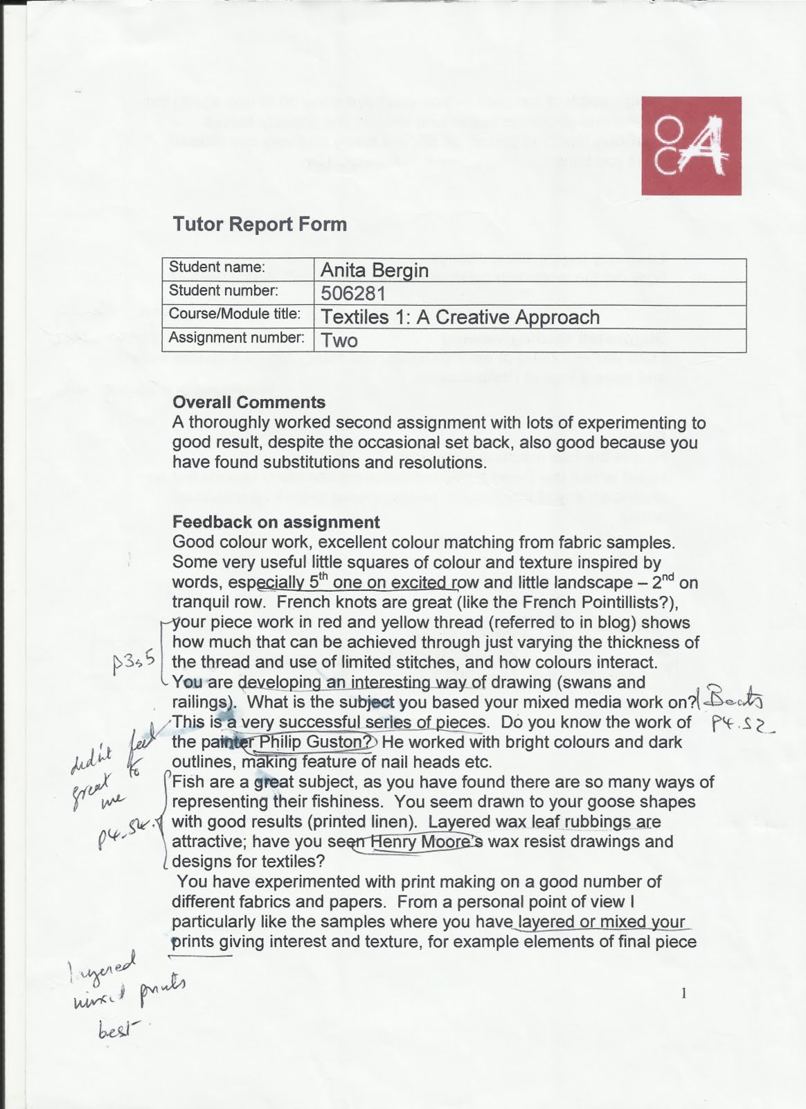
Tutor's Report


Friday, February 4, 2011

Learning Log: Assignment 2 ; Building a Visual Vocabulary ; Colour, Design, Printing and Painting


PROJECT 3 - Colour

Loved working with colour though found some of the colour perception exercises weren't as easy as I'd expected.
Really enjoyed working up 2 colour wheels ( though found it hard to get the greens right) and loved mixing and matching to the colours in pictures and fabric


Found it easiest to work with gouache - pure and easy to rinse - found watercolours more volatile and acrylics less forgiving. Got stuck on one colour and found my Daler Rowney colour wheel was a great help because it did tones tints and shades.

Loved the section on responding to colour and had great fun using colours to express different feelings.

The colour theme I chose is Winter Mornings - I'm very drawn to the soft greys, silvers and violets that greet the day at this time of the year.

I enjoyed the stitch exercises in stage 5. Obviously it takes longer than with paint to make an impact but the experience has great depth.
I used red and yellow threads of different weights on a black fabric. Preferred the effect of the thinner threads. Could see how the two colours close together looked orange and the thin yellow against the strong red looked almost white. Could also see how less dense stitching was impacted more by the bachground colour - eg red looked darker, yellow lighter.


For Stage 6, I read up on Suerat and Pointillism and looked up some of his work : La Grande Jatte, Bee du Nec and Channel at Gravelines. I was interested in his method - first covering the canvas with a layer of paint, then overpainting in local colours in broad strokes and finally building up the image using multicoloured dots -  using a restricted palette of 4 colours and their intermediaries mixed with white.

I tried to stitch a fish by this method using french and bullion knots. Had a measure of success but it would have been better if I had shaded the the ground material first as it's hard to get the context right : either it doesn't blend in sufficiently or it disappears into the background.

Overall, I'm really pleased with what I've done and learned during this project.
Further development : I need be more spontaneous at noticing and recording colour combinations that work well and that I respond to.


PROJECT 4 : DEVELOPING DESIGN IDEAS

How it went :
I enjoyed the Stage 1 exercises on making space move and am more drawn to dynamic arrangements

I enjoyed Stage 2, Exercises 1 to 3 looking for Shapes and then learning to hone in on texture, colour and shape and decide which to prioritise and using different media.

I found Ex 4 - drawing from real objects - harder and had a number of tries at this before I was happy to move on

Stage 3 - Selecting from my Drawings. I got bogged down in this for a while. Felt my drawings weren't good enough and got into a loop doing more and more drawings to no avail.

The problem knocked on to Stage 4 - Developing Design ideas where again I wasn't very happy with my design ideas .Thankfully I got help from The Complete Guide to Creative Embroidery. The chapters on Exploring Ideas and Selecting a Theme were great. I tried out some of the ideas around a sketch of tulips and was finally able to move on.

Regarding the working method,  I haven't cracked it yet, but even coming back to this book made me realise how much I've learned and I expect that with more practice it will come easier to me.

Follow up
  • I've started to keep a record of ideas for further exploration.
  • I've also booked a half day workshop on Sketchbooks for Textile Artists which is being run as part of the Cork Textiles Network annual conference on Saturday March 5th

INTERLUDE - EXPERIMENTS WITH PRINTING AND PAINTING

I had great fun with this.
I got great help from Ruth Issets Print Pattern and Colour which had clear and  concise instructions and materials outlines.

 Her approach is also inspirational and exciting with beautiful illustrations: I love the layers of colour and texture she achieves.
I made some of my own print blocks using foam and drink straws on board - the straws worked best.
I also tried making lino cuts and string blocks and while they looked great on paper, I found it hard to get a clean print when I moved on to fabric.


I tried all the basic printing techniques - I loved using both relief prints and the brayer to create a textured finish (thank you Ruth !).


PROJECT 5 - PAINTING AND PRINTING ON FABRICS

Loved this project !!!

I got a bag of end cuts from a local interior decorators so had lots of different fabric types to work with

Some of the inspiration came from design ideas from Project 4 (bird stencil in Night Flight) while others came from the interlude experiments (repeat prints).

Repeat Prints
Tried printing on many different types of fabric and for the repeat pattern did one piece where colour was more important and a second where the texture of the fabric was key to the design.

I liked the contrast in textures and the effect from using the brayer rolled across the print block - only problem is I can't seem to keep it straight

Both in Assessment Submission


 Single unit pieces
I did a number of runs at Night Flight - first trying the lino block, but couldn't get a clear print using the fabric paints,
Decided to use a stencil instead on a rough fabric, using the brayer to mimic the sea and the sky - think it worked well.


I also tried printing on net curtains - Waterfall. Think this is interesting and full of movement with potential for further development


Silk Painting
Ordered  Silk Painting - New Ideas and Textures from the library. Got it yesterday and plan to try out some of the techniques over the next few days.

Update: As it transpired there was nothing new in the book - it was printed in 1993 and is older than most of my own books. My favourite of my own collection is "Inspirational Silk Painting from Nature"  which has some beautiful evocative paintings. I like both the heavily textured naturalistic works of Marianne Laurent and Susanne Holtweische-Misgeld and the light filled expressive works by Irmes Grund.


I'm also intrigued by "Steadfast",a work by Monika Nelles which is painted on silk with attached linen threads.I love the  contrast of the substantive round shape with the skinny legs and the scratchy threads which anchor it to the ground.


I decided to try some lino prints on painted silk. It took some time to get them to work as the silk paints are very runny. I  did a repeat print with a fresh Spring feel and a single unit print in antique tones. These pieces are my favourites: I love their translucence and luminosity.


Both in Assessment Submission
Tutors Report


Thursday, October 14, 2010

Learning Log: Assignment 1: Building a Visual Vocabulary ; Drawing


PROJECT 1 : Making Marks

Where I'm at...

I have enjoyed exploring the different ways of making marks and was reasonably inventive.

Regarding my output, I'm not sure that my drawings are particularly expressive.
I have little confidence in my drawing ability and while in theory I appreciate the emphasis is on observing and capturing a response, in practice, I stray back to trying to depict rather than express that response.

But I do see this first project as a chink opened in a doorway...I'm not in yet, but the view is tantalising.
I will need to experiment and practice constantly to become confident in expressing myself and plan to set aside time for this as I work through the course. First step is to work through some of the techniques in "An Introduction to Mixed Media"  , which came through from the library this week.

I also appreciate that strength in this area will hugely inform my future textile work in terms of being able to capture and then effectively express my response to things.

Find it's taking me longer than the guide times to get through the material. That's fine -am happy to put in the time needed to get a good foundation.

Finally, very happy to have finished my first project... more confident now stepping up to the next one.

How it went...
I enjoyed looking at the work of some artists in terms of the variety of marks they made.


Van Gogh used strong swirling looped marks to great effect in" Cornfield and Cypresses"
 Paul Klee used scratchy thin lines, almost scraffito -like in "Fish Magic", Picasso's horse in "Guernica" is a medly of marks, while Rousseaus "The Snake Charmer" is a symphony of different textures.

At the beginning of Stage 2 - Making Marks in an Expressive Way, I found it difficult to vary my marks and many of the results looked similar.


I was happier playing with the different materials in Ex 3
Overall I felt I got best results from exercise 4 where I was able to experiment with a wide range of media and methods
I particularly liked the rubbings using bleach on tissue paper and the collage.


I do find that I tend to use the same few favourites eg watercolour pencils and wax pastels and will need to stretch myself to experiment more.

I was looking forward to starting Stage 3 - Using Marks to Create Surface Textiles
In general I got most enjoyment out of making marks in relation to the objects ..as most of them had emotional significance for me and I enjoyed trying to represent that.
Found I was more rational in how I tackled the visual sources.
In responding to the words, tended to take the word as a command - "fast" meant I drew fast etc

Two exceptions to the above
  • got completely bogged down trying to represent the surface of a block of wood from the garden...still haven't cracked it despite numerous attempts. Will have another go later using collagraphy
  • one of the visual images - burren rocks -had particular resonance as it was from a card I had sent to my mum who died 2 years ago and I seemed to respond differently to that than to the other visuals.
Really enjoyed using the viewing frame, both to help highlight interesting surface textures and to go deeper.

Favourite media: like mixed media best - gives me a chance to build up the texture so what I draw comes closer to what I wanted to express. Like using crayons, watercolour pencils, water soluble wax pastels acrylics and bleach. Particularly liked using resist techniques, collage and frottage.

PROJECT 2 : Developing Marks into Stitching and Making Textures.

Really enjoyed the weeks doing this project though progress was slow - not a proficient stitcher so working through took longer than guideline times. Have gotten a bit faster and expect this will improve with practice.

Used the suggested stitches from the manual and others (scroll, coral, feather, detached and twisted chain) from The Practical Encylopedia of Sewing - Dorothy Wood : the embroidery section has really good diagrams/ photos which show how to do a wide range of stitches. Tempted to try out all sorts but found I need to get confident using the core group first and can expand to more unusual stitches later.


Went through the first four chapters of Stitch Magic by Jan Beany and Jean Littlejohn. I found this great for showing how the stitches can be used creatively. It has great illustrations of stitches being used as marks to create fabulous textures and also gives good detail on the ground being used.. My favourites were generally multi-layered eg a piece by Valerie Quay which has rich sumptuous tones highlighted by detatched chain or a piece by Jean Littlejohn which uses "distorted bullion knots.. on a cotton ground with acrylic painted bondaweb ..to evoke a seascape" In both cases I like how there are restful areas and how the texture is heightened as you move down the pieces.

I'm happy with the progress I've made and feel I got more confident as I worked through the assignments: Stages 2 and 3 were painfully laborious whereas Stages 5 and 6 were much more fun.
I was happier working with stitch than I was with the drawing in Project 1, but this was probably because I had the source material from the Project 1 to work from and also I love stitch being used in textiles and found that practising the stitches made me think more about the types of marks and how to represent them.

I found stages 2 and 5 great in that they made me put in the time to explore the line and texture stitches and build confidence in using them. Because I'm so slow, these took much longer than I thought they would to do and I sometimes I got impatient to move onto the more expressive work.

Samples
Loved doing the samples at stages 3, 5 and 6 and feel they worked better in their own right as I went along - the Stage 3 sample is pretty meaningless without the drawing, the others stand up better.

I enjoyed using both stitch and yarns to create texture, but found them very different:


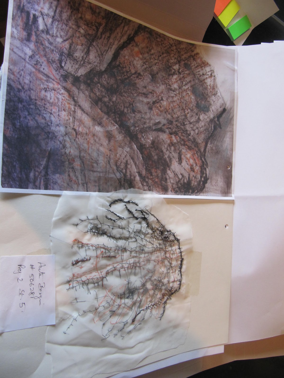
  • Stage 5 : Using stitch was a much slower build especially as I chose to use white voile as the ground, but it was very satisfying to see the textures build according to the stitches used - eg cretan overlaid on herringbone and blanket stitch. I'd like the piece to have more impact , but don't know how to bring it out more.
  • Stage 6 : Using yarns was more dramatic. I used a variety - torn fabrics, paper from flower arrangements, sewing, embroidery and knitting yarns, angelina strips, metallic threads. I had great fun with this and think the sample has more energy and impact, though it is more pictorial and I hope that's not a problem. I did find I tended to be too timid with the stitching....what looked bold up close had little impact at arms length, so I had to do a number of runs at it. I also think I should have put more areas of contrast in the upper third. Better next time.

In all cases, I had decided in advance on stitches and yarns to use to develop the drawing, but found I added to these as the work progressed.
I enjoyed working from the drawings for inspiration and found it stimulating to try to interpret rather than slavishly reproduce the drawings.

I'd like to experiment with more layered and textured grounds and also try some machine stitch samples ...

I tried a small bit of machine stitching but machine is old and soon ground to a halt. I used straight, zig zag and some decorative stitches but plan to do much more over the coming weeks. Bought a book to help (Beginners Guide to Machine Embroidery - Pam Watts) and bought a new Singer machine - a special today in LIDL today ! - which can do free stitching.

Other

Reading
I've started The New Textiles by Chloe Colchester. Enjoying her matter of fact treatment of the subject and intrigued by the openly female perspective. I'm on the Textile Design section, where most of the text is at the beginning, with the illustrations grouped from p 41 to 104. Will have to go through it a few times as most of the names are new to me and also need to work out which illustrations can be found where. Also will need to summarise what I've learnt as it's easy to read passively when studying on my own.

Also bought a book to help me with sketch book / mark making..as I'm struggling a bit here. It's called Drawn to Stitch by Gwen Hedley and I'll be using sections of it over the coming weeks.

Tutors Report